How do you know if your safety signs are getting ignored? Conduct a self-audit to see where you can incorporate the following psychological principles. The following steps will help you assess your signs and labels beyond basic compliance and make sure they're an effective deterrent of unsafe behavior.
Personalize it.
People are bombarded with signs and eventually become desensitized. This makes them more discriminatory as far as what information to let in. If the information is customized to them, they're more likely to take it seriously. For instance, emails that include a recipient's first name in the subject line have much higher response rates. It signifies that the message is intended for them and may have value to them.
Company logos on signs can help create a sense of tribe, particularly with happy employees, who respond well to company calls-to-action because they're driven to super-serve their company. But if you can personalize it even more with wording and placement, you increase the potential for impact. A sign hanging on the wall that says "Turn machines off at night" may achieve some effectiveness. But if you place a label on each machine that says "Night shift operator ? turn machine off at night", you'll improve response rate by creating a sense of identification and culpability. Be as specific and personalized as possible.
Change them up.
Our nature is to pay attention to new items on the landscape, because something new is more likely to present a potential threat than something we're used to seeing. Because of this, signs and labels lose some of their impact over time. Here's proof: take a piece of paper and sketch (from memory) what elements are on the front and back of the penny, including placement. Now look at a penny (or look up images online if you don't have one) and see how accurate you were. Many people get several elements wrong, even though they have seen a penny thousands of times! Your brain recognizes key elements like color, size, and Lincoln, so you no longer pay attention to the other elements.
Unfortunately this means that as long as a sign stays in the same position without change for months or years, a sign's effectiveness decreases. It will still create a response for new employees or those not familiar with that area, but the seasoned employees probably only have a vague concept of the message, as in the penny test. To spot-test effectiveness, ask someone that works nearby what a certain label says and what it means. If they falter, it's time to change up the labels. Even moving it one foot over or slightly rewording the message can renew the impact. Staying within the constraints of compliance and best practices, change it enough so that it seems visually different, and it will again grab attention and bolster the efficacy of its message. Consider placing some signs on sign blanks so they can be easily relocated.
Use active language.
If your sign wording seems vague or passive, or the activity it mentions sounds pretty low-risk, the message won't be taken that seriously. "High voltage" is strong, but "High voltage ? Keep out" is stronger. "No lifeguard on duty" is vague. Does that mean swimming is not permitted? "No lifeguard on duty - Swim at your own risk" is clearer. People may disregard an emergency exit sign, but "Emergency exit only - Alarm will sound" mentions negative consequences and will probably result in cooperation.
Inform the sign viewer what is expected of them, and use a forceful tone when compliance is critical. "Private property" is vague and passive but "No trespassing" should improve the response rate. It consolidates the information to the salient point, has a minimum of words, and its message is clear and strong.
If signs refer to actions in a certain area, such as "Hearing protection required in this area", be sure that it's clear what area the sign refers to. If possible, reinforce that message while also clearly designating the area with floor marking tapes. Aisle tapes with preprinted warnings can feature the message "Hearing protection", which leaves no ambiguity. If you're within the taped area, you know you need hearing protection. If it is not possible to mark the designated zone, then post signs at all entries or points of approach. To make the message even more effective, make hearing protection available next to the "Hearing protection required in this area" sign.
Use specific graphics.
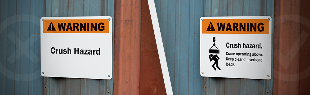
Our brains process graphics more quickly than words. Words need to be converted into a mental image to be processed, and if there are a lot of words or the sign is poorly worded, conjuring up a mental image can take longer. Imagine a sign that says "Warning: Hearing protection required in this area." That's fairly straightforward, but it's seven words and takes a moment to read and process the information. Now imagine a sign that shows a person wearing hearing protection. You immediately grasp the message, and it's effective even if the viewer doesn't speak English.
Another advantage to graphics is they can convey the fear factor of a hazard far better than words can. In other words, scare your viewer a little bit and they're far more likely to comply. The common sign "Danger: Keep hands and fingers away" has a clear message, but the words don't impart fear. It doesn't conjure up a mental image of extreme physical impairment and pain. Add a symbol of a hand getting crushed by gears, and the viewer will likely register fear of potential damage to the hands. The message gets taken more seriously in the short run and will be more memorable in the long run. Be sure to choose graphics that are accurate to the situation. If you have a DuraLabel printer, then you also have a library of over safety 1,800 symbols. Use these symbols often in your signs to strengthen your message.
Make them visible.
If your message is critical, make sure the sign is large enough to reach viewers from an appropriate distance. If something is flammable, do viewers have to be within a few feet to see the sign, putting them too near the potential hazard? If in doubt, make it too large rather than too small.
Place them where they'll be most visible. If they're intended for people entering an area, make sure they face the direction of typical approach, at about eye level. If they're intended for a machine operator, place them where the machine operator will be looking when they need the message. A sign hanging near a machine cautioning of pinch points is good, but a label right by the pinch points is more likely to be noticed at the crucial moment.
Use appropriate colors.
Our brains respond quickly to colors, and create associations. This is why you don't see black shampoo, and labels on natural products are often green. Color-coding may be adapted to suit your workplace, but make sure the meaning behind the colors never changes. If red means fire or danger, don't use red signs to lead the way to the main office, or your message will become confused and diluted.
Though OSHA, ANSI and other standards cover basic principles of sign layout and colors, they don't help with the psychology that will achieve maximum compliance from those viewing it. That part is up to you.